The Power of Colour: Pantone's Colour
I love colour! It is one of my passions – I love it’s power to change our mood, to change our appearance, I love it’s power to help us feel warmer or cooler, to transform our homes and of course to communicate! So each year I get very excited when Pantone announces its new colour of the year.
Back at the start of 2020 when the world had barely even heard of Covid (remember those days?) Pantone’s colour was “Classic Blue”. At the time I interpreted this as the antidote to a world in overdrive, a signaling of our collective desire to hit pause, to slow down, to reflect. [read my post here] I thought we all needed some time to re-evaluate what was important to us all, and Classic Blue was just the colour for this.

Well. 2020 turned out to give us a whole lot of time for that and more! It was a pretty scary time, and in my view, Pantone’s pick for 2020 could not have been better. Classic Blue not only signifies reflection and introspection, it is also the colour of reassurance, calm, competence, an ‘It’s ok, I‘ve got this” kind of colour. Just what we needed: cool, calm and collected.
Fast forward to January 2022 (I will comment on the 2021 choice later). Pantone’s colour for this year is called Very Peri. It is a slightly warmer take on Periwinkle Blue, and it is a ‘mood booster’ colour. Although Very Peri sits in the blues family, it’s red undertones offer vibrancy, energy, and sparks creativity and joy, and nudge the colour towards the purples.

Purple is a colour we most often associate with power and wealth. This is partly due to its historical rarity and eye-watering expense! Around 1200 BCE, the ancient Phoenicians discovered they could create the colour by crushing the shells of a certain sea snail. The process was both labour intensive and required vast quantities of raw material – around 250,000 shells were required to produce just 30g of dye, known as Tyrenian Purple. It was literally worth more than it’s weight in gold.
Right up until the mid 19th century, this was the main way to produce the colour purple. In Ancient Rome, the colour was reserved for magistrates. During the Roman Empire, several emperors decreed it to be exclusive to them. Rulers of the Byzantine empire also chose this colour, and even in the 20th Century, Queen Elizabeth 2nd wore purple after her coronation.

In 1856 the first synthetic purple was produced thanks to serendipitous failure. Chemist William Perkins was attempting to make a synthetic Quinine to help treat Malaria, however he created a sticky mess! In trying to dissolve the sticky substance in alcohol, he discovered it produced a rich purple colour. This dye became known as Alinine Purple, or Mauvine, and enabled the colour to be used more widely and produced at vastly lower cost than Tyrenian Purple.
Purple is a balance of the primary colours Blue and Red. As such it is often regarded as a colour that signifies balance and harmony. At the same time, it is often viewed as unconventional and creative. The links to creativity derive from its ability to both calm and stimulate at the same time, a balance of mental clarity and energetic stimulus that help the mind to wander constructively. This also supports the strong link between Purple and spirituality.
Very Peri is described by Pantone as a ‘warm and friendly’ blue – something that clearly picks up on the sentiment of 2022. We have been through a traumatic two years, forced to isolate, to socially distance ourselves, to live in a way that, for a social animal, feels very uncomfortable. I have been living in France and Italy for most of the past 20 years, where social norms are to greet friends and colleagues – and even relative strangers – with kisses on each cheek. For the past two years we have all been awkwardly dancing around each other, maybe daring an elbow bump or a fist bump. I now find myself recoiling on instinct from handshakes and hugs due to fear of Covid! This feels awful since I was always one to greet with hugs and kisses, always happy to meet new people. “Warm and friendly” is how I felt pre-Covid and a sentiment I certainly crave now!
In contrast, Pantone’s choice for 2021 was more of a ‘high alert’ combination: grey and yellow. Pantone couched it in terms of stability and hope, however the mood of 2021 was characterized more as lurching from one day to the next trying to make sense of the constant change. The grey, to me, represented the impersonal and distant feel of ‘society’ during 2021: harsh, cold, stark, and ideally, sterile - despite the intent that it represent solid dependability. The yellow represented both a warning light and a grasping for sunshine and the outdoors as we faced multiple lockdowns of varying degrees.

So Very Peri is very welcome! It feels like a fresh start. An acknowledgement that the world has changed but WE can make the change work FOR us. We have the reassurance of the solid blue base and the freedom to let our imaginations go and dream big. The red undertones give us the energy to try something new and do it with a smile.

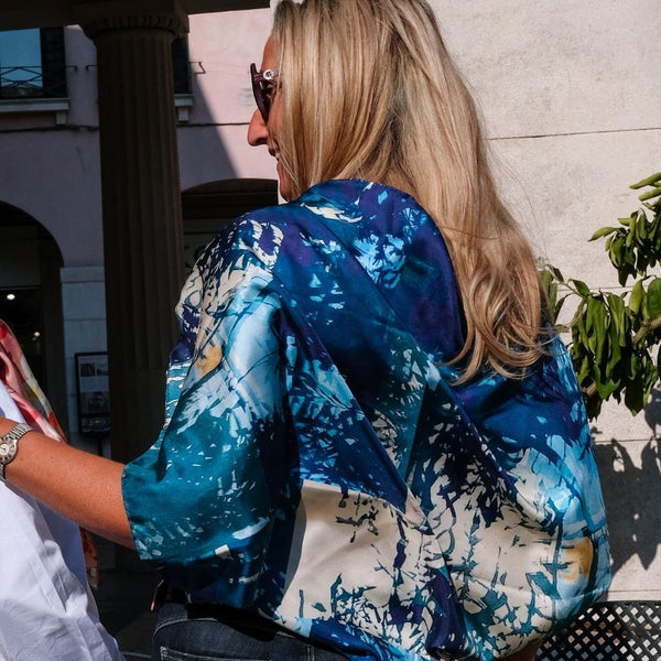
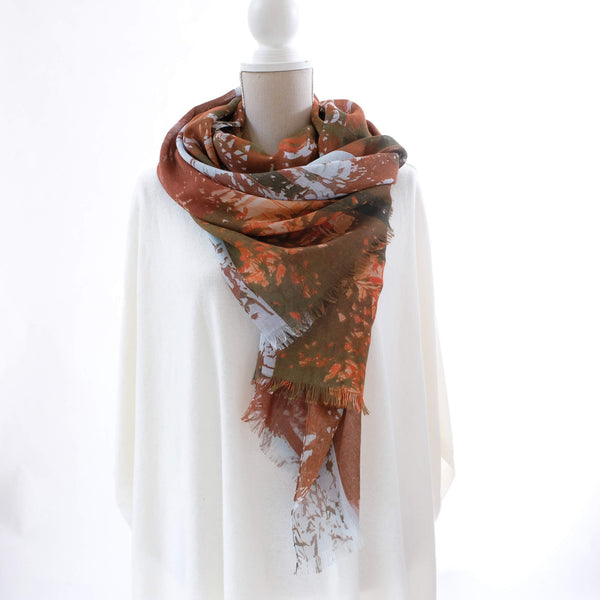
To celebrate this wonderful, hopeful colour, Louis Jane has brough out a new colourway for our Wild Bounty design. Wild Bounty, as it’s name suggests, is about the rich exuberance of nature expressed by flowers in full bloom. So it just feels natural and appropriate to release this design in the warm and joyful tones of Periwinkle ‘Very Peri’!


Before I go, a quick question for you: how does this colour make you feel? Drop me an email to let me know!